July 2019
Santa Barbara Zoo
A nonprofit responsibe website redesign casestudy
Role
UXUI Researcher & Designer
Partner
Arish Dubash
Overview
The zoo is a happy place for everyone, especially for families with kids. The inspiration of this project derived from wanting to better the local entertainment experience that we are so deeply connected with. Some questions also came up during our discussion, such as “I have never visited a zoo’s website, have you?” or “What kind of information is on a zoo’s website?”, enticed us to find out whether people utilize a zoo’s website to the fullest and what information are users looking for prior to their visits.
Our Goal
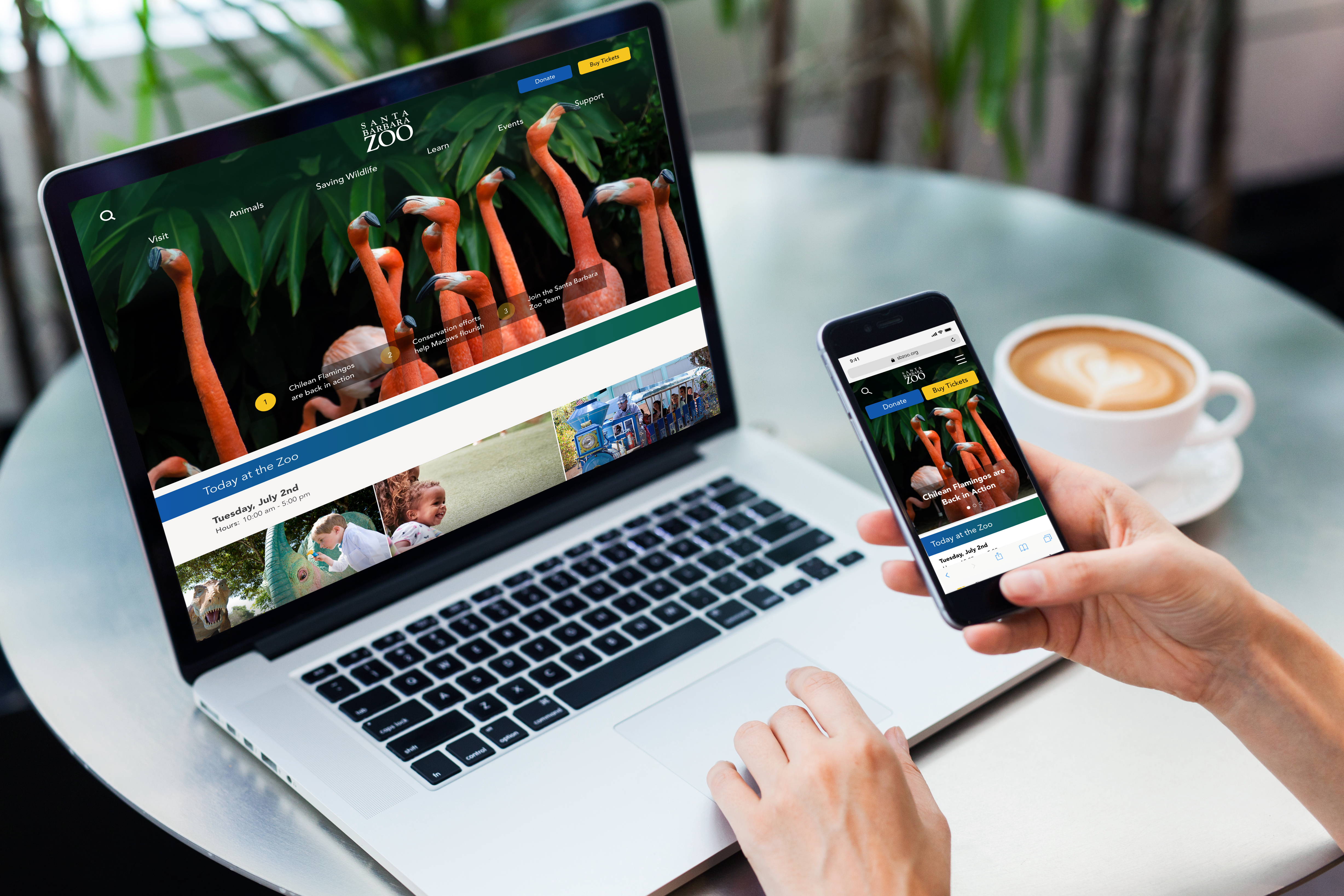
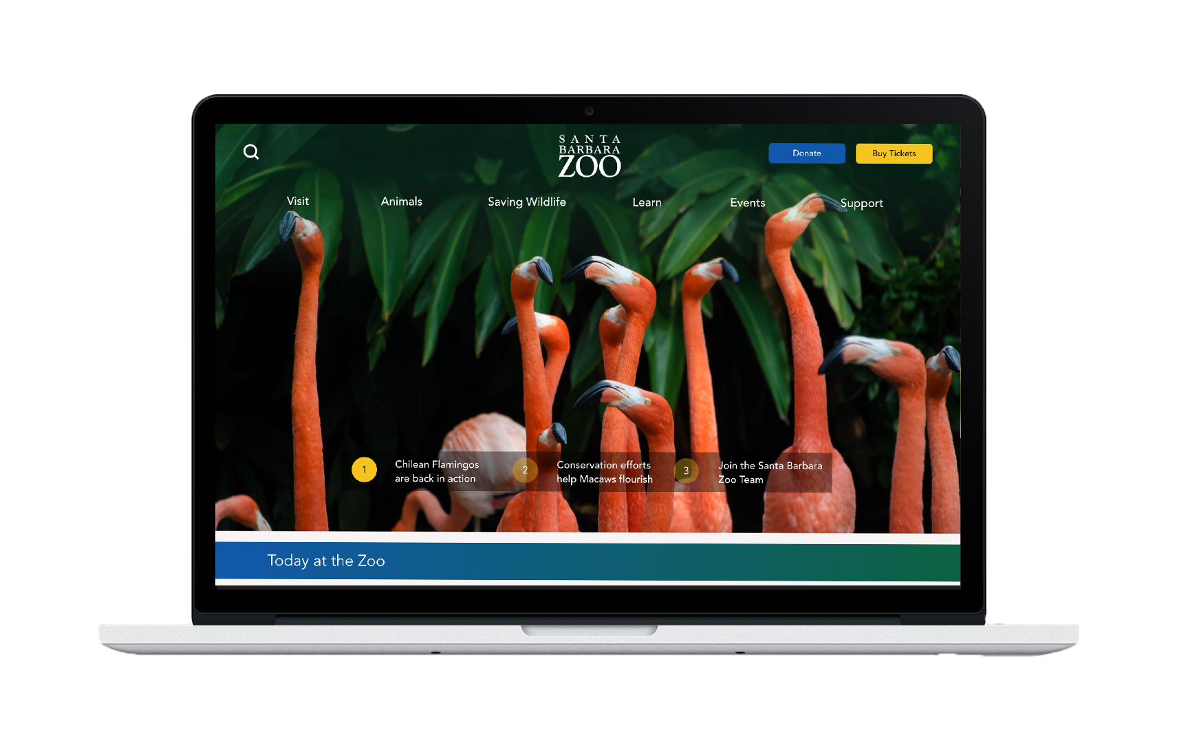
Through detailed evaluation and analysis of the current website, we believe that users find themselves overwhelmed due to the clashing nature of the layout's elements and lack of visual guidance. The goal is to re-evaluate and re-design the current Santa Barbara Zoo website to help generate traffic to the site and encourage ticket purchases and donation.
User Research & Insights
Online Surveys and User Interviews were conducted to find out the fundamentals of :
WHO
is
our user and why people visit the zoo?
WHAT information does users look for
prior to
their
visits?
HOW is the current website? (Strengths & Weaknesses)
01
Motivation
- Enjoyment
- Education Opportunity
- Events
02
Priorities
- Hour of Operation
- Ticket Purchases & Prices
- Types of Animals & Attractions
- Special Events
03
Current Website
- Color Confuse Hierarchy
- Equal Weighted CTAs
- Tile Design Overused
Our Approach
With distinguished pain points and unique takeaways, the team decided to simplify the two main actionable user flow - buy tickets & donate - and re-evaluate the content hierarchy on their landing page to provide users a more guided, intuitive experience.
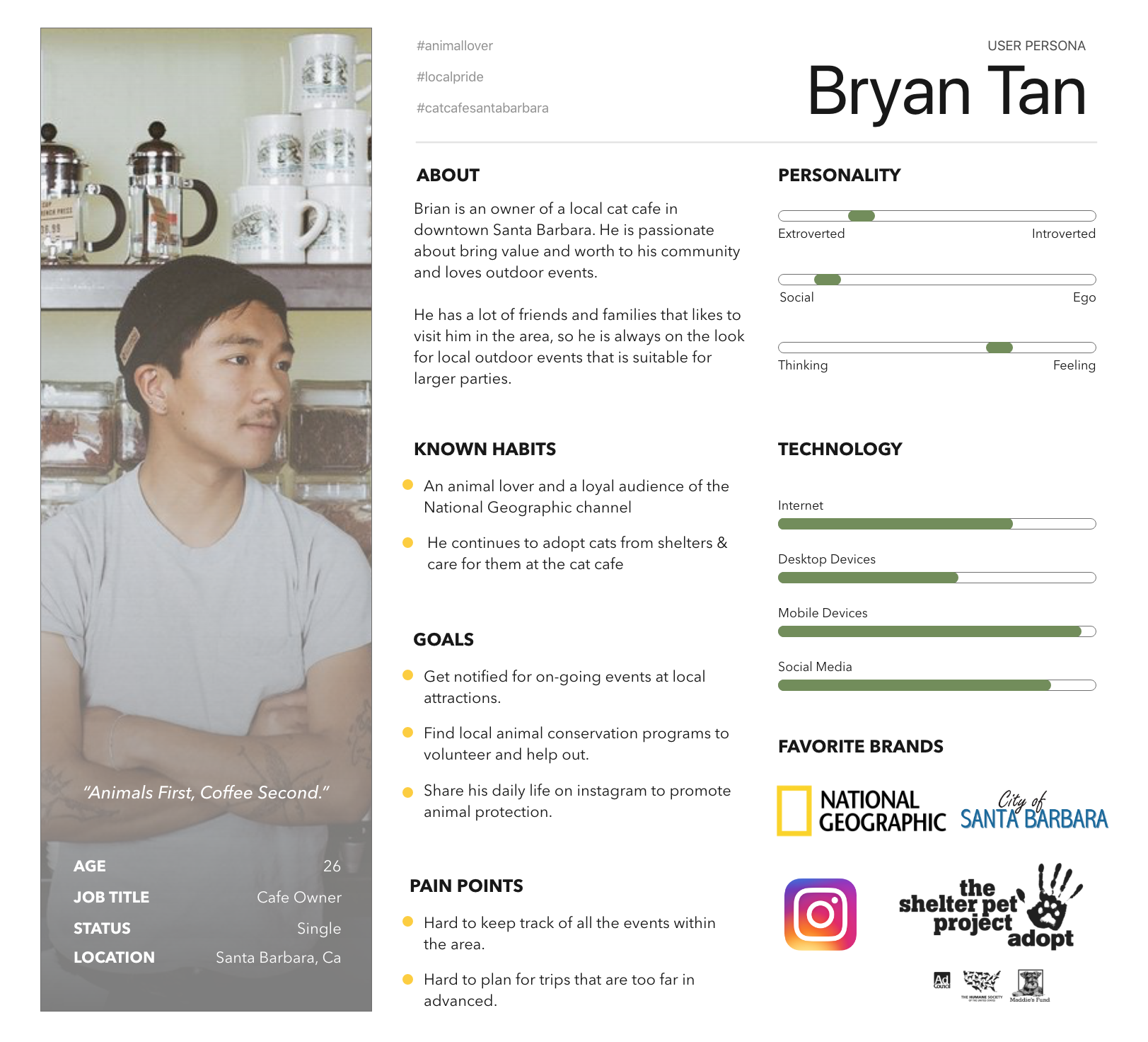
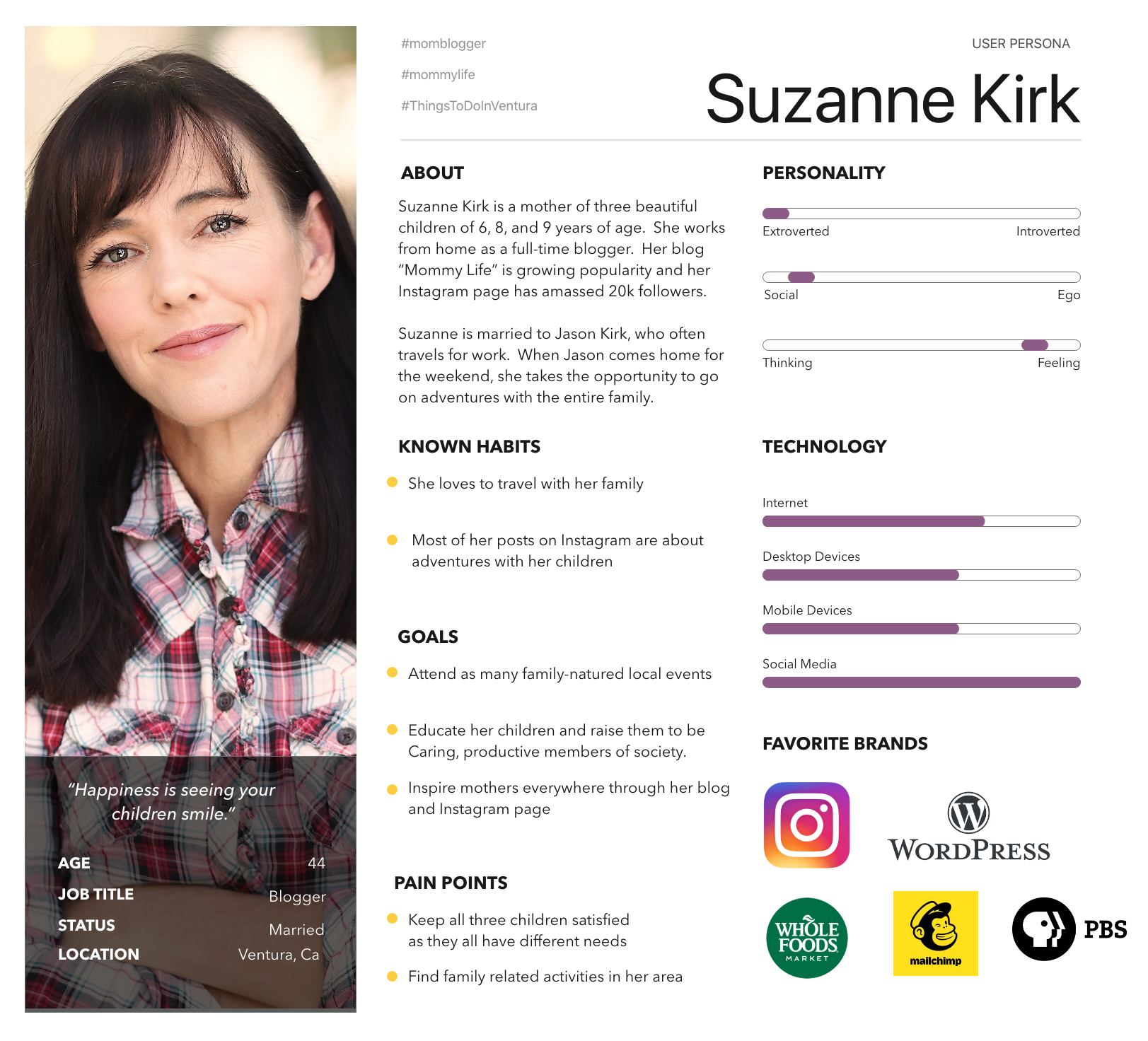
Our Users
Two user personas were created to represent Santa Barbara Zoo’s targeting groups - young adults & families. The two users guided us through the whole design thinking process as we brainstorm ideas and make revisions.
Storyboard
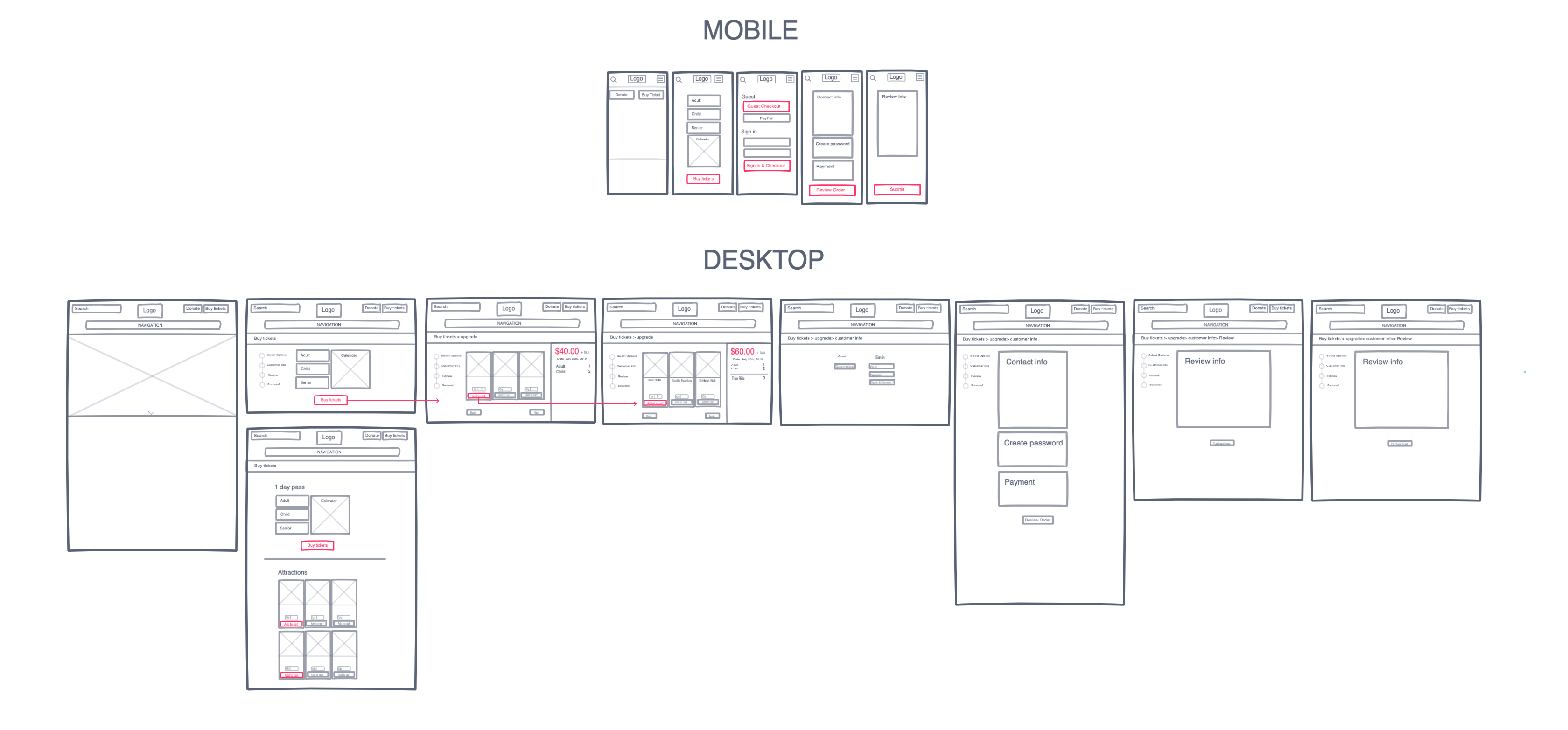
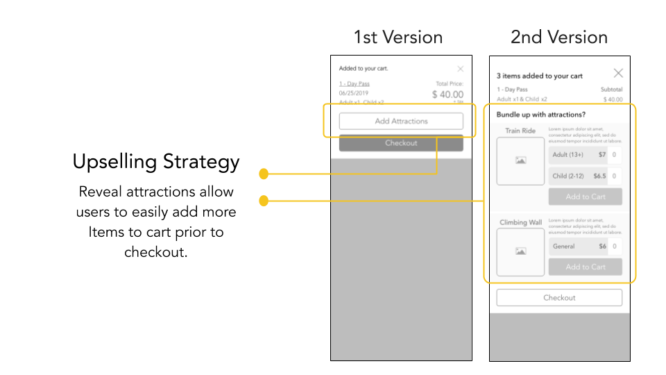
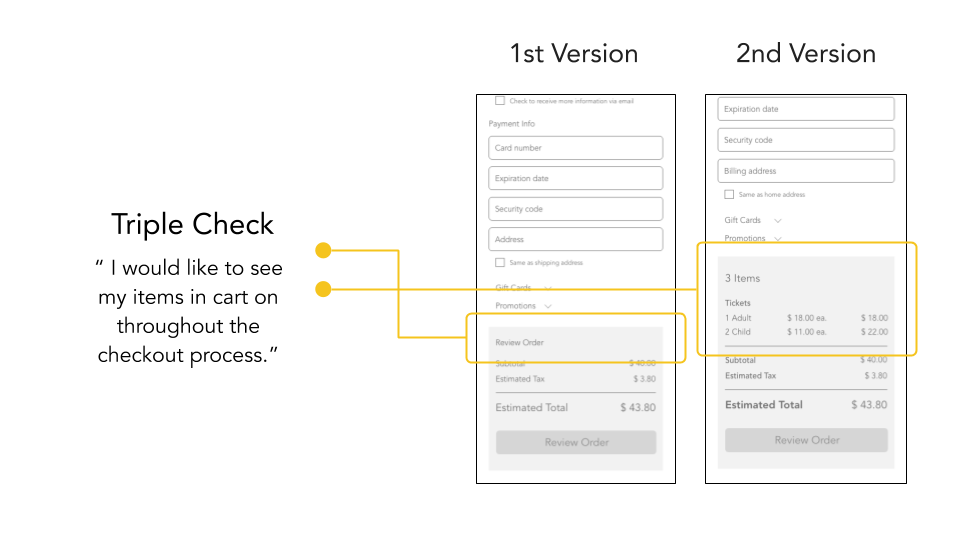
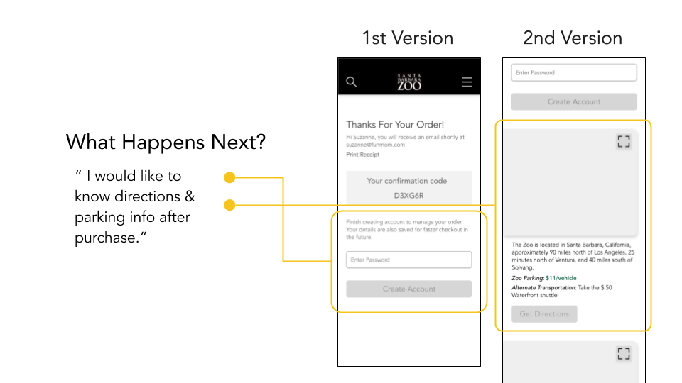
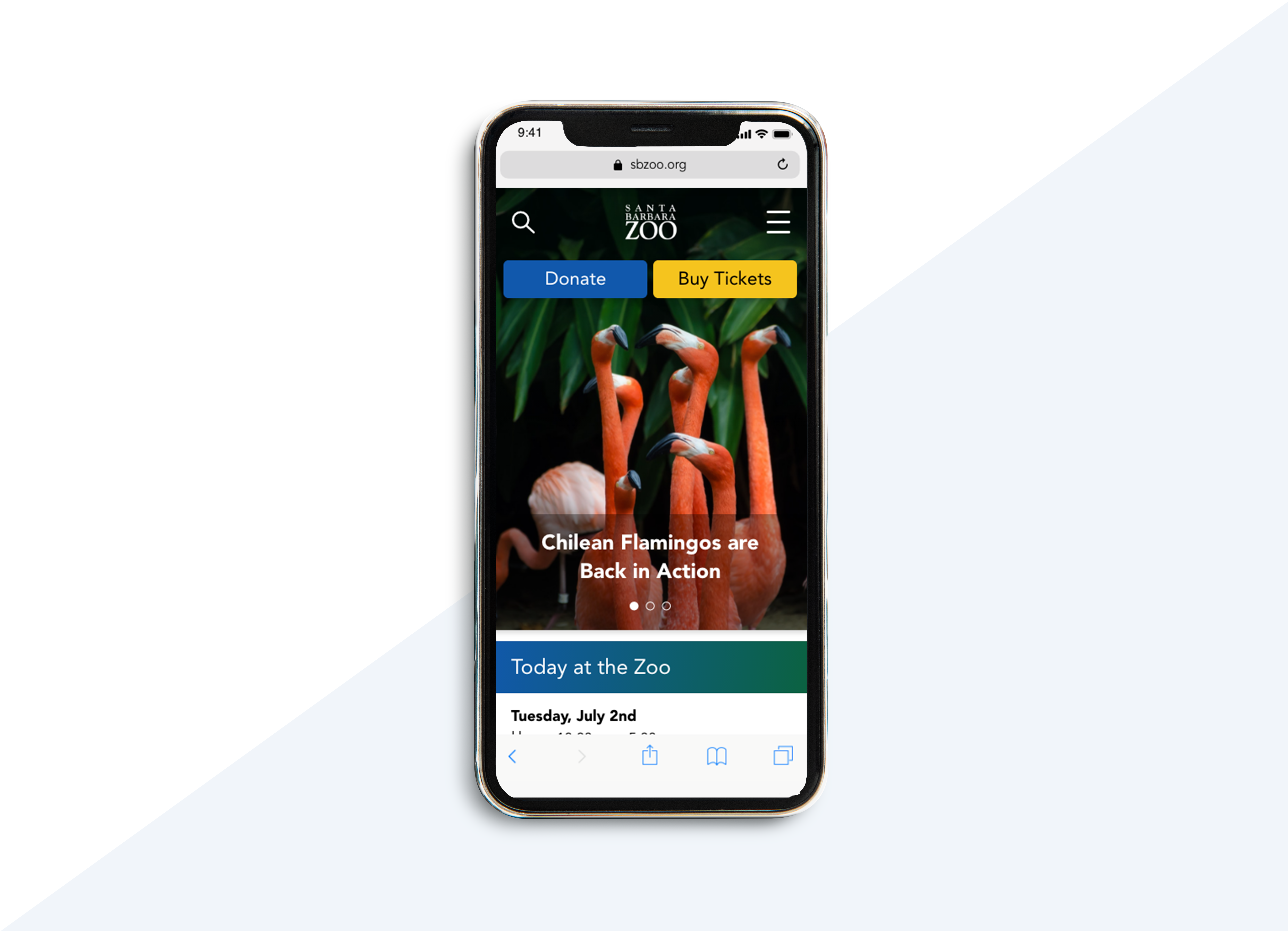
Mobile First
Our design development started with mobile device. It allows us to prioritize our features and focus on what is necessary. After several user tests, we were able to highlight some key points to make adjustments to the second wireframes.
More Projects
Impact
Media Partner Platform Redesign
Environmental Protection Agency
Government Website Redesign
Squek
Mobile App Design